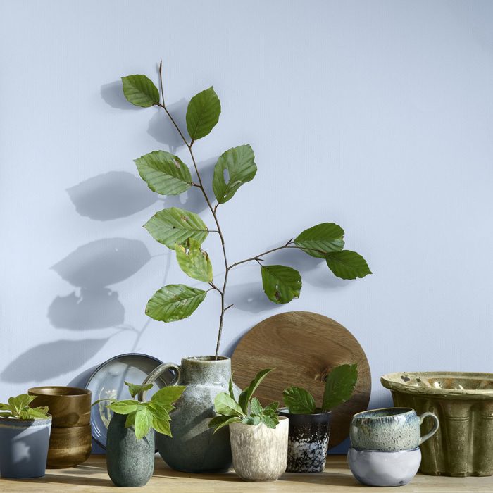
Dulux has made Bright Skies – a light sky blue – its 2022 Colour of the Year. The colour is said to symbolise the return to freedom and reflect optimism.
Bright Skies can be paired with a variety of shades and, as a guide, Dulux has created four ‘ColourFutures’ palettes – Greenhouse, Studio, Salon and Workshop. The 37 total curated colours within the palettes match with the blue shade and work together to make a distinct look.
The Workshop palette is described as having “light and positive colours that make the functional fun”. Greenhouse is more natural with fresh green and blue shades. Studio is more pastel with a mix of pale blues, pinks, reds and oranges. Salon has softer and pale shades that are more neutral but also blend with the pale blue of Bright Skies.
Marianne Shillingford, creative director of Dulux UK, said: “Right now, people want to feel revitalised and enjoy the freedoms that are returning to them, to look out and bring in new ideas. What better inspiration can we take than the endless skies around us?
“Biophilic design, which embraces design cues inspired by nature, is entering the mainstream, and it is now widely known that nature makes us feel better and taking steps to bring the outside in enhances our sense of well-being.
“Whether clients want spaces to work, relax, teach or exercise, it is essential to have colours that reflect the optimism and desire for a fresh, new start that is top of the agenda for the year ahead. However, Bright Skies and the palettes are not about idle daydreaming. It is about turning those dreams into reality and forging ahead with the changes that we want to make.
“This is why the Dulux Trade Colour of the Year and supporting palettes are practical, open and flexible to all kinds of requirements. Professionals should relish talking to their customers about the transformative impact these colours can have.”
Bright Skies is the 19th Dulux Colour of the year. It was put through the same creation process of all the former shades by AkzoNobel and looking at global design trends and getting insights from designers across all sectors.
The AkzoNobel Global Aesthetics Centre in Amsterdam held a virtual conference to decide the colour of the year. The event was attended by leaders across a diverse set of design disciplines including, fashion, colour and interiors.
Heleen van Gent, head of the AkzoNobel Global Aesthetics Centre, said: “Over the past 19 years, we’ve seen a dramatic shift from a concentration on brighter tones to an emphasis on neutrals.
“This year, however, vibrant colours and light tones are re-emerging – a reflection, perhaps of our need for positivity and a fresh approach. After a spell of feeling shut in, we crave expansion – the great outdoors. The 37 curated colours in this year’s collection help to make it easy to choose complementary shades.”
