
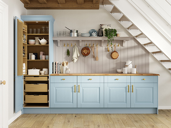
How can retailers make the most of the rise in colourful kitchens?
Goodbye 50 shades of grey, and say hello to earthy tones and deep warm hues – this is a key message that is coming through in kitchen design for 2025.
Words: Francesca Seden
Trends are moving away from cool, clinical and sometimes stark minimalism, towards more organic shades ranging across putty, taupe, greens and mushroom, offering, as Uform category manager Sara Cotter notes, “a much softer, and more inviting aesthetic.”
To ensure a scheme that doesn’t feel two-dimensional and flat, these calm neutrals are often best paired with deeper organic hues, including dark blues, forest and olive greens, and even rich burgundy reds, terracotta, and black to inject depth and sophistication.
Pastels like blush pink, pistachio, mint and light blue can are also popular, for a fresh and vibrant look.
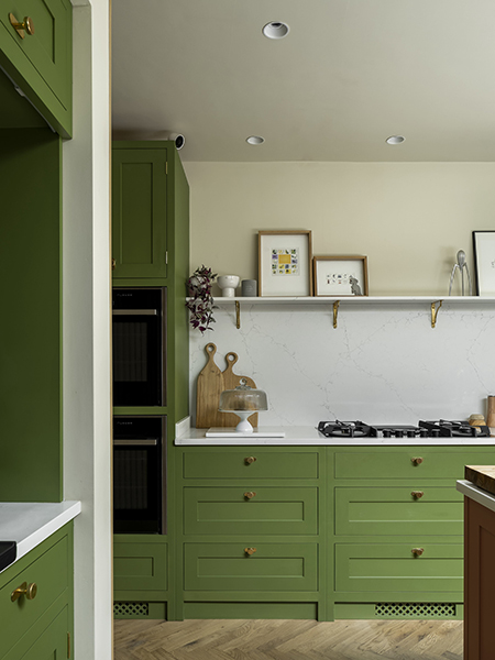
“Homeowners are increasingly drawn to contrasting materials, both in texture and colour,” says Olive and & Barr founder, Al Bruce. “This has led to more experimentation with various wood finishes, embracing the rich and varied tones of oak and ash, which pair beautifully with natural stone and brushed brass hardware.”
Neptune design director, Fred Horlock, goes on to say that, as “people increasingly care more about the environment and the important balance the natural world has on the home and general wellbeing, warmer colour tones and uplifting bold colours are becoming more and more important to the home.”
In terms of what is driving these trends, there are a few factors at play. People are bored of ‘safe’ neutrals, as they’re more likely to be improving than moving, plus they want something more uplifting, and are no longer afraid to really express their personality.
According to Stuart Dance, managing director at InHouse Inspired Room Design, there is “an interesting link between colour trends and global stability – when times are politically and economically uncertain, people crave energising, bright colours as a form of self-expression and even escapism, leaning into boldness and individuality and rejecting the ‘safe’ neutral colours that are often preferred in times of stability.”
Symphony’s design manager, Josie Medved takes a similar line, but with our homes becoming an escape in which we can “feel restorative, cocooning and in tune with the slower pace many people are striving for.”
Social media has also fed significantly into the trend, with Instagram and Pinterest full of inspirational DIY influencers who demonstrate the full extent of what is possible.
Uform’s Cotter adds: “Design reports show a strong preference for vibrant, character-rich spaces. Retro influences from past decades are making a comeback, inspiring bolder choices and playful combinations. But it’s not just about cabinetry – colour is showing up in islands, walls, tiles, and appliances.
“Ultimately, it’s about personality, Cotter adds. “People want their kitchens to reflect who they are, and colour is one of the easiest ways to do that. Whether it’s a subtle accent or a full-on statement, colour is helping turn kitchens into spaces that feel warm, welcoming, and uniquely theirs.”
Thinking about top tips for putting colourful schemes together, our contributors suggested choosing one dominant colour, and then layering one or two complementary shades to avoid visual overload. “Use the boldest tones strategically on an island, dresser, or inside cabinets,” Cotter continues, “so they make an impact without overwhelming the room.”
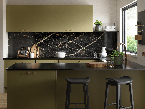
Getting the lighting right is also crucial as getting it wrong can make the room look washed out or too saturated. “Lighting temperature, for instance, such as cool white or warm light, also makes a difference in how we perceive colour and feel in a space, so it should be considered in the overall design,” Rachel Tuckey, chief product and marketing office at Häfele UK adds.
Neptune’s Horlock talks about colour drenching, commenting that “a bold colour drench across walls and cabinetry can create great impact, whilst also diminishing the visible scale of the cabinetry, making the room feel cohesive and considered.”
He also says that for those not so confident to use colour in a big way, a bold pop of colour on bar stools or a kitchen island can also be a great way to inject personality and interest.
Symphony’s Medved adds: “a single hue across cabinetry, walls and ceilings, can create a cocooning effect. It’s a statement choice that works best when paired with carefully chosen lighting and textures.”
She also talks of another approach – the two-tone kitchen, in which designers can combine a core neutral with a distinctive accent shade, most commonly by making the island the standout feature. “However, there’s flexibility here – a tall pantry, a bank of base units or wall cabinetry can be finished in a contrasting shade to add interest and personality.”
Chloe Blanchfield, product marketing manager for Hisense UK, agrees with this idea, adding: “While homeowners remain cautious about moving away from safe neutrals for applainces, there is a appetite for bolder tones and distinctive designs.”