
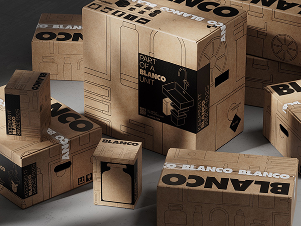
Sink and tap specialist Blanco is introducing a new “streamlined” packaging design, which the company says is closer aligned with its modern brand identity.
Blanco says the new design features features a more clearly visible brand name, as well as consistent “Part of a Blanco Unit” iconography. In addition, the new packaging uses only brown recycled corrugated cardboard, with only one printing ink being used instead of two.
According to the company, new products are already being delivered in the new packaging, and its packaging for existing products is in the process of being adapted for the newly released design.
“We have made a huge leap here,” reflected Moritz Brodmann, Blanco’s head of global packaging. “Previously, we had a hodgepodge of different materials, colours and prints for our packaging, which were also very elaborately redesigned again and again.
“Now we have a uniform solution that can be scaled and that appeals to customers and consumers much better. Our new packaging is a promise of quality, innovation and what makes our brand unique.”