Bathroom specialist CP Hart explains how it was tasked with creating a master en suite for the gentleman of the house that would be masculine, stylish and calming
The client asked us to design a room that would be contemporary and stylish, but with timeless features in keeping with the age of the property.
He requested a natural and neutral palette, but was also drawn to the colour blue and so that was the starting point for our project – where we used this as an accent colour for the vanity unit and exterior of the freestanding CP Hart Audrey acrylic bath.
The rest of the bathroom was fairly neutral and calming, with natural textures such as porcelain stone-effect tiles, which was similar to some of the natural stone used elsewhere in the property. We also worked around the room’s original focal point, the fireplace, which we wanted to keep, to make it feel more like a classic living space.
Stone-effect porcelain tiles on the floor and some walls helped further meet the client’s wish for natural textures. Most walls were also painted to keep the space feeling soft. Bespoke SSI frameless glass was used for the shower to help it feel as open and spacious as possible, given that the ceiling was not overly high.
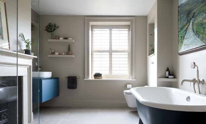
The furniture elements in the room had a satin finish, and when it came to brassware, we chose products from the Samuel Heath Landmark Pure range in a satin nickel finish, again keeping with the soft, tactile and natural look the client had specified.
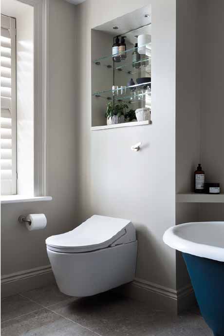
The WC used in the room was a washlet model from Toto RX with lever handle by Samuel Heath, again in a satin nickel finish.
Natural, soft, and luxurious – with a pop of colour. This is how all the rooms were designed, with the period of the house always in mind. We also wanted to bring a bit of the outside countryside into the interiors, so we decided to go with more organic rounded shapes, rather than angled or geometric.
Adding blue as a pop of colour was what the client had requested. This was introduced in the satin glass Artelinea furniture and bath exterior, which we painted in Farrow and Ball’s Hague Blue.
For the lighting, we incorporated ceiling spots and an Artelinea Prisma mirror that, thanks to its hidden diffusion light, produced a halo of light behind it.
The walls were painted in Farrow and Ball’s Drop Cloth to produce a natural and relaxing atmosphere, while the timber shelves next to the basin and either side of the bath were also painted in this colour so as to blend into the walls.
To finish off the styling of the room we added various pieces of artwork to the walls.
Installer Comments
The bathroom designs [six in all] were very demanding thanks to the type of property we were working with. There was a lot of work in preparing the rooms and making them suitable for a renovation. All floors were reinforced and completely new plumbing installed. There were two bathrooms where the design was possible only if we demolished a wall separating them. We rebuilt the wall and ran the plumbing services within the wall to maximise space in the bathrooms.
In most bathrooms, we adapted the property to the design. In the master en-suite bathroom, for example, there were voids, boxing and walls that we had to work around and adapt to the new layout and plan.
There was a wall moved in the master suite to gain space and rehouse pipework. Also, a wall was reconstructed between two of the smaller bathrooms, as it was to house the WC cisterns for both adjoining rooms, without needing to build out further.